


Workshops, Labs & Rapid Experience Design
Learn from your customer, move faster, inspire your team!
Hopscotch Labs enables rapid product development through workshop-based research. Explore how we apply these workshops to deliver measurable results:
- Co-Design with your customer
- Rapid experience design
Creating the right artifacts can set the stage for necessary conversations, create clarity from nuance, and get everyone on the same page.
Remote co-design with the Customer
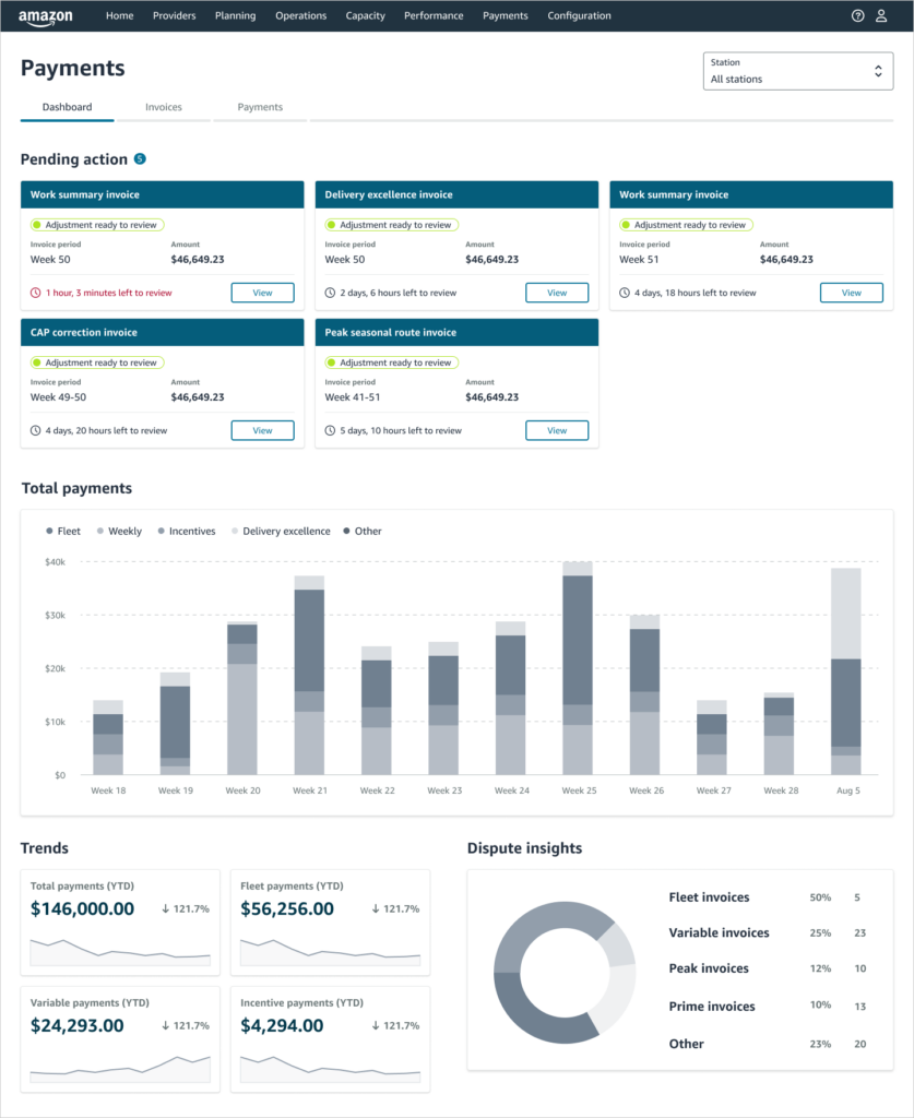
To develop a vision of the future payment dashboard, we paired remote research with design exercises and quantitative measures.
client: Amazon (Founder experience)
industry: Logistics / Fintech (enterprise technology)
project: Payments Dashboard and Future Vision
services: Research Ops, UX Research
The challenge
Move past the ‘list’ to meet DSP needs to fully understand their current and potential earnings.
Project goals
- Improve DSP’s financial outlook and decision making to decrease turnover.
- Simplify invoicing and reconciliation to give DSPs back time.
- Work with UX and Product to develop a vision for a new payments homepage and dashboard.
We started the project with deep knowledge on the customer and how they manage their finances. As a team, we decided that a design-based vision would provide the team the big ideas they could refine against business directives, and give leadership an immediate idea of our direction. We also had a designer who was eager to run sessions and needed a method that would support their design process. We set up 60-minute customer interviews, built the Figma research file and partnered with the designer to execute the sessions.
“The payment portal is amazing! And I love that invoices have type and name now! Makes bookkeeping sooooo much easier! Thank you for hearing what we needed and getting it done quickly! Win win!” —DSP owner
Amazon launched the payments portal, completely overhauling the legacy DSP payments experience and making it easier for DSPs to find, review, and download their invoices. It included a host of new features: centralization and search-ability of all invoices; a new, top-level “Pending action” section with to-the-minute countdown timers so that DSPs can prioritize invoices to review first and take action based on the time remaining. It was designed as a mobile-first experience, so that DSPs can review invoices and prioritize next steps on the go.
- 71% reduction in median dwell time per session, from 7.4 minutes to 2.1 minutes in the new UX—saving DSPs 5.3 minutes per session
- 90% reduction in invoice targeting and download, from 30-40 seconds to 3-4 seconds
- 94% reduction to complete basic invoice search and collect tasks, from 2-3 minutes to <10 seconds
Remote co-design with the Customer
To develop a vision of the future payment dashboard, we paired remote research with design exercises and quantitative measures.
client: Amazon (Founder experience)
industry: Logistics / Fintech (enterprise technology)
project: Payments Dashboard and Future Vision
services: Research Ops, UX Research

The challenge
Move past the ‘list’ to meet DSP needs to fully understand their current and potential earnings.
Project goals
- Improve DSP’s financial outlook and decision making to decrease turnover.
- Simplify invoicing and reconciliation to give DSPs back time.
- Work with UX and Product to develop a vision for a new payments homepage and dashboard.
We started the project with deep knowledge on the customer and how they manage their finances. As a team, we decided that a design-based vision would provide the team the big ideas they could refine against business directives, and give leadership an immediate idea of our direction. We also had a designer who was eager to run sessions and needed a method that would support their design process. We set up 60-minute customer interviews, built the Figma research file and partnered with the designer to execute the sessions.
“The payment portal is amazing! And I love that invoices have type/name now! Makes book keeping sooooo much easier! Thank you for hearing what we needed and getting it done quickly! Win win!” —DSP owner
Amazon launched the payments portal, completely overhauling the legacy DSP payments experience and making it easier for DSPs to find, review, and download their invoices. It included a host of new features: centralization and search-ability of all invoices; a new, top-level “Pending action” section with to-the-minute countdown timers so that DSPs can prioritize invoices to review first and take action based on the time remaining. It was designed as a mobile-first experience, so that DSPs can review invoices and prioritize next steps on the go.
- 71% reduction in median dwell time per session, from 7.4 minutes to 2.1 minutes in the new UX—saving DSPs 5.3 minutes per session
- 90% reduction in invoice targeting and download, from 30-40 seconds to 3-4 seconds
- 94% reduction to complete basic invoice search and collect tasks, from 2-3 minutes to <10 seconds
Creating the right artifacts can set the stage for necessary conversations, create clarity from nuance, and get everyone on the same page.
With access to the customer limited, rapid experience design creates successful projects, and early customer buy-in.
Rapid experience design
Five 1 day sessions with clients to: observe their activities, interview users and design the tools to effectively order and track package delivery.
client: Airspace Technologies
industry: Logistics
project: Customer Portal Redesign
services: UX Research (discovery through usability testing), Workshop facilitation
The challenge
With customers accustomed to low switching costs and facing new entrants, Airspace needed to improve customer satisfaction in their primary logistics ordering platform.
Project goals
- Find ways to improve the user experience
- Help retain market leadership, and
- Eliminate customer friction with the primary experiences (ordering and delivery).
Hopscotch Labs developed 4-hour rapid research and prototyping sessions to maximize customer time, create buy-in with the customer, and provide design outputs that would accelerate design development. Sessions paired observation, interviews and UI sketching, worksheets created consistency across research, and concluding design workshops gave us immediate user feedback, eliminating additional rounds of discovery research.
Research insights that drove design development
- The last 500 feet of the delivery created a lot of churn for everyone involved.
- Driver availability is directly affected by app usability and instructions from operations.
- Transparency from end to end provides customers control and confidence in a chaotic process.
Customer need for process transparency and driver accuracy changed Airspace’s approach to product development. Driver app features were moved up in the timeline. Transparency features were added to the UI. These insights became the hallmark of customer facing tools.
- Airspace launched the new client dashboard 6 months later and received 40% more business from FedEx.
- Stakeholder interviews resulted in a living journey map that Airspace now uses for all customers to identify their critical moments of the package journey.
With access to the customer limited, rapid experience design creates successful projects, and early customer buy-in.
The right engagement builds customer excitement, gives your team the space they need to create, and moves you forward fast.
Civic co-design workshop
Deep dive research and co-creation sessions to redefine reporting processes.
client: City of San Diego
industry: Government/ Civic tech
project: Get it Done: Internal and external reporting
services: Management consulting, Co-creation workshops, UX research, Research Ops
The challenge
Residents over report issues in the app because they don’t see action taken. Lacking the right information to act on and duplicate reports, City employees close the ticket.
Project goals
- Identify opportunities to improve effectiveness of resident reporting and regain their trust.
- Improve the utility of the information coming into the City.
- Help City employees track and report their mitigation efforts effectively.
Residents lacked incident status on the items they posted, causing them to repost. City employees lacked system statuses and the ability to combine duplicate incident reports, making it difficult to close duplicate tickets that may have work assigned.
After the interviews, we structured the research to focus on reporting and communication needs for both user types. Utilizing workshops to maximize input in a short timeframe, participants worked together to identify issues, frame opportunities, and define the experience that would result in the best outcomes for their user type.
Hopscotch Labs provided user requirements, UX design examples, and use cases to the City for status updates, two-way communication, more context, instant reporting. The majority of findings were incorporated into the Get it Done app.
Civic co-design workshop
Deep dive research and co-creation sessions to redefine reporting processes.
client: City of San Diego
industry: Government/ Civic tech
project: Get it Done: Internal and external reporting
services: Management consulting, Co-creation workshops, UX research, Research Ops
The challenge
Residents over report issues in the app because they don’t see action taken. Lacking the right information to act on and duplicate reports, City employees close the ticket.
Project goals
- Identify opportunities to improve effectiveness of resident reporting and regain their trust.
- Improve the utility of the information coming into the City.
- Help City employees track and report their mitigation efforts effectively.
Insights
Residents lacked incident status on the items they posted, causing them to repost. City employees lacked system statuses and the ability to combine duplicate incident reports, making it difficult to close duplicate tickets that may have work assigned.
Actions
After the interviews, I structured the research to focus on reporting and communication needs for both user types. Utilizing workshops to maximize input in a short timeframe, participants worked together to identify issues, frame opportunities, and define the experience that would result in the best outcomes for their user type.
Outcomes
Hopscotch Labs provided user requirements, UX design examples, and use cases to the City for status updates, two-way communication, more context, instant reporting. The majority of findings were incorporated into the Get it Done app.
The right engagement builds customer excitement, gives your team the space they need to create, and moves you forward fast.
Let us help you move forward with conviction.
At Hopscotch Labs we use workshops to drive creativity, decision making, and collaboration. Using them, we’ve helped cities redefine their website content by focusing them on the user’s experience. We’ve helped Amazon Delivery get behind a dedicated app for their delivery partners; build annual product roadmaps; change the conversation for business coaches; build 3-year visions for communications, logistics, and HR management; and we’ve used workshops to help UX get ahead of product and engineering cycles.